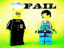
Okay, this is one of my creations. First, I'm going to start off by saying what I used to present it, which sticks out more on my MOCpages version. http://www.mocpages.com/moc.php/210906
I used the back of a Pink Floyd LP known as Animals. It worked. I also stood it up on my Felix & C-64 creation (only available on MOCpages.com), it helped raise it to the height where the city ended on the LP.
What I was happy with was my work on the trail. However, I did not love my rockwork. For me it seems like I just threw in a couple of slopes and pretended I was okay. I thought it was purely mediocre. The figures, I was pretty content with them. I used a technique for a bacpack which I had never seen any other person use. The skeleton was great, I borrowed the skeloton arm design from a custom General Grievious. The legs, I'm pretty sure SirNadroj has used. the editing process was pretty much of a pain. First, I dimmed the lighting. Then I cropped. Then, I put on a little nametag. Overall, I would give it an 8/10. Why? The rockwork was shabby. That was a big part of the look. I dimmed the lighting a bit too much. Ouch, that takes away 2 points. It's a good creation, but I could have done better.
Wednesday, June 30, 2010
Just My Beginning
Saturday, June 26, 2010
It's A Tool Creation!
Heheheh, bad pun. Pete (as shown as the awesome in this photo) photographed a new favourite of mine. Well, first off, the walls are great and detailed, just like I expected them to be. The figures are well done but there's no doubt that the red one is the best. Now to the miniscule details: the two giant mustard containers (ha) to the right are a frequently used , but never get old. The cart is spectacular, good job Pete! The door is great as well. Now, for the main focus on the picture, tools and desk. The desk is fine, but Peter's big collection of ABS made tools steal the show. Overall, I would rate it 10/10. Yes, no flaws. Thank you Pete, for showing this!
Tuesday, June 15, 2010
What You Lookeeng At?
Yay! Good guns. The gold gives it a finish. The guns are pretty cool. The colour scheme is cool. This one gets a 'great rating'. Hooray! Nau, check it out.
Sunday, June 13, 2010
NCS Sky Cobra (Profiles)
Now if you will please, view pasukaru76's handsome spaceship. Makes you want to go zooming around the living room. Yes, it is awesome, isn't it? I like the wings, and the fuselage. Very appealing. Thanks for sharing!
Yes
The ultimatum now desires that you please bow down to this MOC from... Drumroll please... JimmytheJ! It's great. Over to the cockpit section, and just behind it is a juicy engine. If you'd like, you can check out the killer thruster this baby has. The features he added are pretty cool. So... Check it out.
Thursday, June 10, 2010
Hovering NCS
JimmytheJ here, has created what I consider to be a great concept, and execution. Seriously, how can you not like those sweet curves! So, a great way to show off your skills, worth more than 10/10.
